You may not need a carousel at least for mobile browsers
Approximately more than 85% of our visitors access yemek.com from mobile browsers. Most of us have used a carousel at least once in the components or somewhere in projects. In yemek.com, we were using react-slick which works well on desktop but causes some performance and memory leak problems on mobile browsers.
See here:
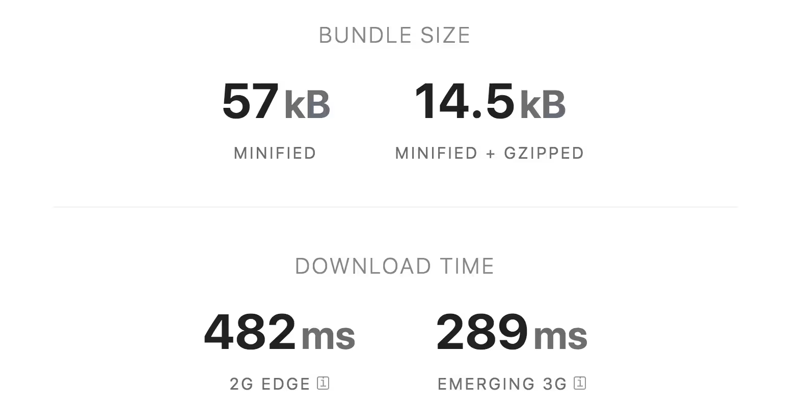
It was causing a freezing bug while scrolling and tapping the hamburger menu that affects user experience extremely bad. Also, the bundle size for react-slick is 14.5kB minified + gzipped.
However, we’ve decided not to use any third-party carousels for mobile browsers to increase performance and user experience.
Let’s start by creating a component called Carosel.js. (We’re using emotion for CSS-in-JS but you can use styled-components of course.)
We’ll have a Container and children of it. So the Container should be scrolled horizontally and shouldn’t be scrolled vertically. Container div will look like this:
Container
const Container = styled.div`
  white-space: nowrap;
  overflow-x: auto;
  overflow-y: hidden;
  padding-left: 18px;
  padding-right: 18px;
  padding-bottom: 18px;
  margin-top: 0;
  margin-left: -24px;
  margin-right: -24px;
  -webkit-overflow-scrolling: touch;
  -ms-overflow-style: none;
  scrollbar-width: none;
`
The children will get a width as a prop to size it correctly. It will look like this:
Carousel
const Carousel = (props) => {
  const { children, childWidth, ...rest } = props
  const Container = styled.div`
    white-space: nowrap;
    overflow-x: auto;
    overflow-y: hidden;
    padding-left: 18px;
    padding-right: 18px;
    padding-bottom: 18px;
    margin-top: 0;
    margin-left: -24px;
    margin-right: -24px;
    -webkit-overflow-scrolling: touch;
    -ms-overflow-style: none;
    scrollbar-width: none;

    > * {
      padding: 0 6px;
      display: inline-block;
      white-space: normal;
      word-break: break-word;
      vertical-align: top;
      width: `${childWidth}`;
    }
  `

  return <Container {...rest}>{children}</Container>
}
The overall of Carousel.js component will look this as well:
Carousel.js
import React from 'react';
import PropTypes from 'prop-types';
import styled from '@emotion/styled';

const Carousel = props => {
  const { children, childWidth, ...rest } = props;
  const Container = styled.div`
    white-space: nowrap;
    overflow-x: auto;
    overflow-y: hidden;
    padding-left: 18px;
    padding-right: 18px;
    padding-bottom: 18px;
    margin-top: 0;
    margin-left: -24px;
    margin-right: -24px;
    -webkit-overflow-scrolling: touch;
    -ms-overflow-style: none;
    scrollbar-width: none;

    > * {
      padding: 0 6px;
      display: inline-block;
      white-space: normal;
      word-break: break-word;
      vertical-align: top;
      width: `${childWidth}`;
    }
  `;

  return (
    <Container {...rest}>
      {children}
    </Container>
  );
};

Carousel.propTypes = {
  children: PropTypes.any,
  childWidth: PropTypes.string,
};

Carousel.defaultProps = {
  childWidth: ‘80%’,
};

export default Carousel;
The result: